Brand Design Manual
Photography & Imagery
All photography of people must be black and white only. This applies to the company website, LinkedIn posts, and all brand communications.
⚠️ Mandatory Photography Rule
ALL photography of people MUST be black and white. No color photos of people are permitted on the website, LinkedIn, or any brand materials.
Photography Style
Do
- • BLACK AND WHITE ONLY
- • High contrast with good tonal range
- • Bright, natural lighting
- • Authentic, candid moments
- • Diverse representation
- • Clean, uncluttered backgrounds
- • Professional, modern settings
- • High resolution (minimum 1920px wide)
✕Don't
- • COLOR PHOTOGRAPHY (forbidden)
- • Sepia or tinted photos
- • Overly staged or stock-looking
- • Dark or muddy lighting
- • Heavily filtered effects
- • Cluttered or distracting backgrounds
- • Outdated technology or fashion
- • Low resolution or pixelated images
Where Black & White Photography Applies:
✓ Company Website
All website imagery
✓ LinkedIn Posts
All social media content
✓ Marketing Materials
Brochures, presentations, etc.
Brand Photography Examples
These examples demonstrate proper black & white photography that aligns with Smarketing brand guidelines.
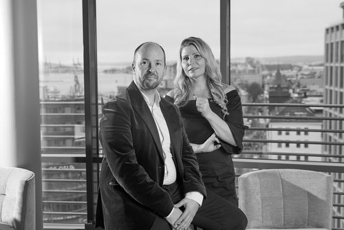
✓ Correct Example
- • Pure black and white (0% saturation)
- • High contrast with good tonal range
- • Natural, bright lighting from windows
- • Professional, modern office setting
- • Clean, uncluttered background with city view
- • Authentic, professional composition

✓ Correct Example
- • Pure black and white conversion (0% saturation)
- • Excellent contrast and clarity
- • Natural, professional lighting
- • Candid, authentic moment captured
- • Modern workspace with clean background
- • Professional yet approachable atmosphere
💡 Key Takeaways:
- • Use natural lighting whenever possible for better depth and dimension
- • Capture authentic moments rather than overly posed shots
- • Ensure strong contrast between blacks, whites, and mid-tones
- • Keep backgrounds professional and uncluttered
- • Modern office settings reinforce our professional brand image
Black & White Treatment
Convert all photos of people to pure black and white (grayscale). Apply these adjustments to maintain brand consistency.
Important: Photos of people must be converted to true black and white (0% saturation). No sepia tones, warm/cool tints, or color overlays.
Contrast
Strong, crisp blacks and whites for impact
Brightness
Slightly brighter to avoid muddy images
Tonal Range
Use full range from pure black to pure white
Conversion Tips:
- • Use "Desaturate" or "Convert to Grayscale" in your photo editor
- • Ensure saturation is set to 0% (pure black and white)
- • Adjust contrast and brightness after converting to B&W
- • Avoid using "Black & White" filters that add color tints
- • Check that whites are bright (not gray) and blacks are deep
Image Overlays for Black & White Photos
When text needs to appear over black and white photography, use these brand color overlays to ensure readability. The underlying photo must still be black and white.
Remember: Overlays don't change the photo requirement - all photos of people must be converted to black and white first, then overlays can be applied for text legibility.
Example: Hero Section with Gradient Overlay
Empower Your Team
Drive growth and collaboration with powerful smarketing tools designed for modern revenue teams.
✓ Gradient Overlay: Evergreen to Dim Grey (#003d2e/85% to #586268/85%) - Perfect for hero sections with prominent CTAs
Example: Content Section with Solid Overlay
Built for Sales & Marketing Teams
Align your revenue teams with shared goals, unified data, and seamless workflows that drive results.
✓ Solid Evergreen Overlay: #003d2e/70% - Brand-aligned overlay for feature sections and testimonials
Example: Card with Dark Grey Overlay
Customer Success
See how leading companies are achieving 3x revenue growth with our platform.
Team Collaboration
Discover how to align your sales and marketing teams for maximum impact.
✓ Dark Grey Overlays: Dim Grey (#586268/75%) and Slate Grey (#758085/75%) - Great for cards and feature highlights
Key Guidelines for Image Overlays:
- • Photo MUST be black and white (0% saturation) before applying overlay
- • Use overlay opacity between 60-90% for proper text legibility
- • Gradient overlays work best for large hero sections
- • Solid overlays work well for content cards and feature blocks
- • Always ensure sufficient contrast between text and background
Example: Evergreen-Focused Design
This example emphasizes the Evergreen brand color throughout the design for a cohesive, brand-forward look.

Unify Sales & Marketing for Unstoppable Growth
The only platform that brings your revenue teams together with shared data, aligned goals, and powerful automation to drive predictable growth.
No credit card required • 14-day free trial
Everything You Need to Scale Revenue
From lead capture to closed deals, our platform provides all the tools your revenue team needs to succeed.
Ready to Transform Your Revenue Team?
Join 2,500+ companies already using our platform to align their sales and marketing teams for predictable growth.
No credit card required • 14-day free trial • Cancel anytime
✓ Evergreen Color Strategy:
- • Hero Section: Strong Evergreen overlay (80%) on black & white photo creates immediate brand recognition
- • CTA Button: Beige button on Evergreen background provides high contrast and follows brand rules
- • Feature Cards: Mix of white cards with Evergreen borders and solid Evergreen cards for variety
- • Stats Section: Solid Evergreen background emphasizes key metrics and social proof
- • Icon Accents: Evergreen circles with white icons, beige circles on green backgrounds
- • Consistency: Evergreen appears in every section, creating cohesive brand experience
💡 When to Use Evergreen-Heavy Designs:
- • Brand-focused landing pages and marketing campaigns
- • Hero sections where you want strong visual impact
- • Product launches and announcements
- • Pages where brand recognition is priority over minimalism
- • Always pair with white or beige for balance and breathing room
Black & White Photography Workflow
Select High-Quality Photo
Choose a photo with good lighting, clear subjects, and strong composition
Convert to Black & White
Desaturate completely (0% saturation) - no sepia, no color tints, pure grayscale only
Adjust Contrast & Brightness
Increase contrast (+15-25%) and slightly boost brightness (+5-10%) for crisp, clear images
Apply Brand Overlays (Optional)
If adding text, apply brand color overlays from the approved palette for readability
Export & Use
Save in appropriate format (JPG/PNG) and use on website, LinkedIn, or marketing materials
⚠️ Final Check: Before publishing, verify that the image is 100% black and white with no color remaining. All saturation must be at 0%.