Brand Design Manual
Advertisement Layouts
Effective advertisement layouts communicate your message clearly while maintaining visual hierarchy and brand consistency. Each layout type serves a specific purpose and audience context.
Core Principles
Clarity First
Every advertisement should have one clear primary message. Avoid cluttering the layout with competing focal points.
Visual Hierarchy
Guide the viewer's eye through the ad in a deliberate sequence: logo/brand → headline → visual/product → call-to-action.
Brand Consistency
Use the Smarketing color palette, typography, and logo guidelines consistently across all ad formats.
Layout Examples
Examples showing different advertisement layout approaches across various formats and platforms.
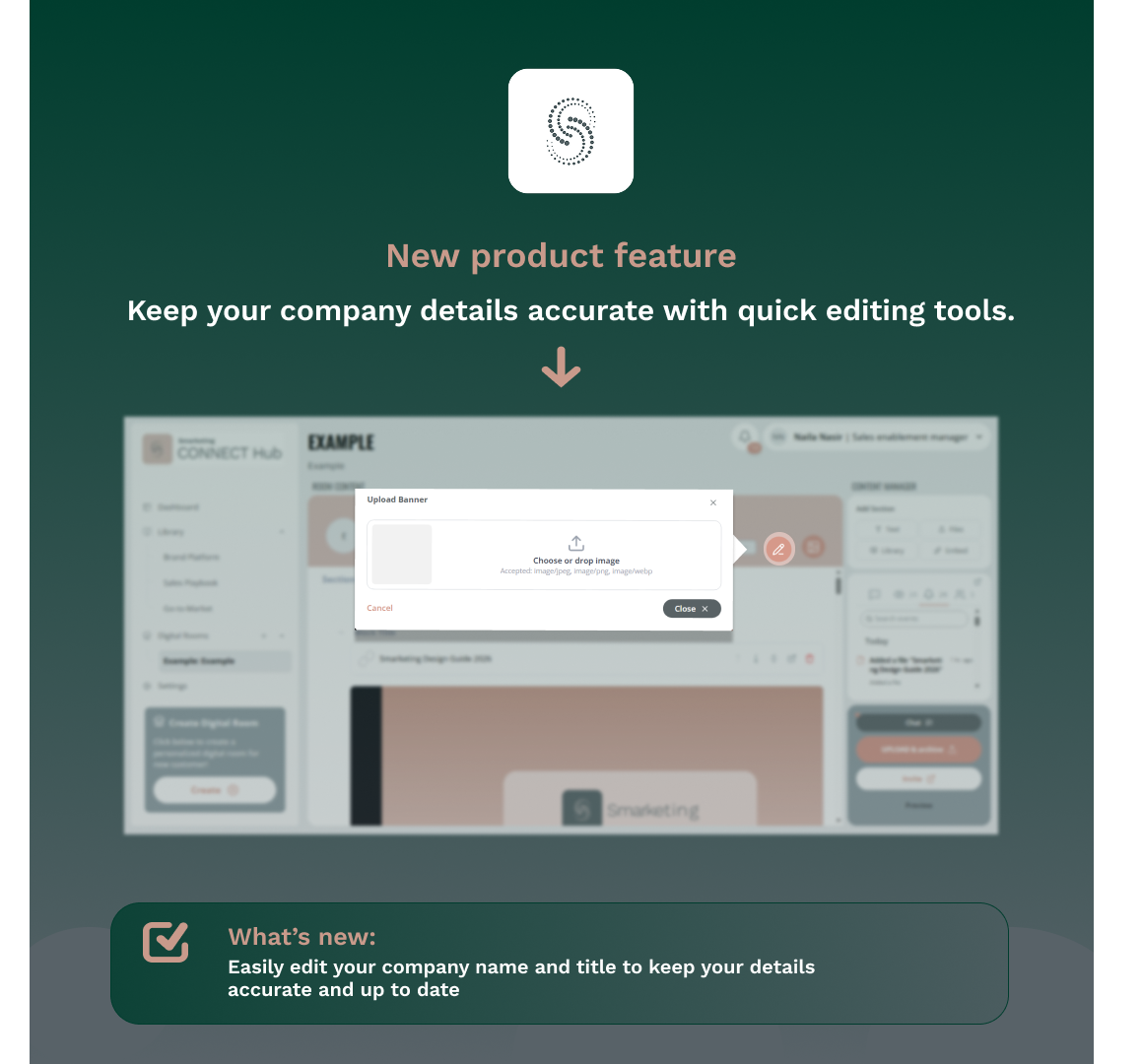
Product-focused square ad with feature highlight and callout box
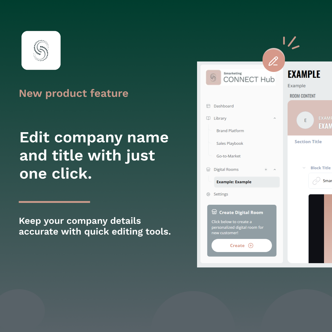
Feature-focused ad with split layout showing product interface
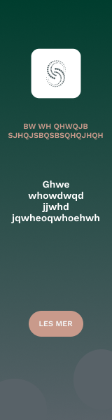
Vertical banner (skyscraper) format for website placement
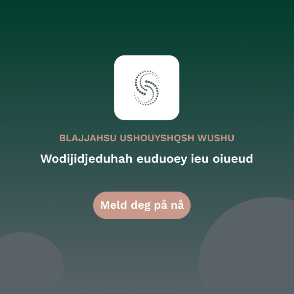
Square social media ad optimized for Facebook/Instagram
General Layout Rules
Spacing & Alignment
- Use the 8px spacing system for all margins and padding
- Minimum 24px margin from ad edges on all sides
- Maintain 16-24px spacing between major elements (logo, headline, visual, CTA)
- Align elements to a grid for visual consistency
- Center-align text for minimal layouts; left-align for copy-heavy ads
Balance & White Space
- Don't fill every pixel—white space improves readability and focus
- Aim for 30-40% white space in minimal layouts, 20-30% in product-focused layouts
- Balance text-heavy and image-heavy sections
- Keep CTA buttons isolated with surrounding white space for emphasis
Adapting Across Formats
- Banner Ads (Vertical): Stack elements vertically, prioritize logo → message → CTA
- Square Social Ads: Center-align for symmetry, use gradients for depth
- Wide LinkedIn Ads: Use horizontal split layouts with text left, visual right
- Mobile Adaptations: Increase font sizes by 10-15%, expand touch target areas for CTAs (minimum 44px height)
Color & Background
- Use evergreen-to-grey gradient (#003d2e to #586268) for premium, professional tone
- Use grey gradients for neutral, versatile backgrounds
- Avoid warm tone (#ecc8c5) as primary background—reserve for accents and CTAs
- Ensure text contrast meets WCAG AA standards (4.5:1 minimum)
Common Ad Format Specifications
| Format | Dimensions | Recommended Layout | Notes |
|---|---|---|---|
| LinkedIn Single Image | 1200 × 627px | Product-Focused or Feature-Focused | Horizontal split works well |
| Facebook/Instagram Square | 1080 × 1080px | Minimal Message-Focused | Center alignment ideal |
| Instagram Story | 1080 × 1920px | Minimal with large text | Vertical stack, mobile-first |
| Display Banner (Wide) | 728 × 90px | Logo + short headline + CTA | Horizontal flow only |
| Display Banner (Skyscraper) | 160 × 600px | Vertical stack | Minimal text, clear CTA |